


In today's blog, NERI economist Ciarán Nugent looks at the recent report published by the Central Statistics Office on the Survey on Income and Living Conditions (SILC) for 2019.
The Central Statistics Office recently published a report and some preliminary results of the Survey on Income and Living Conditions (SILC) for 2019. Some have been keen to point out growing household income figures over the past number of years, a fall in the GINI coefficient in 2019 (the distribution of Irish equivalised household disposable income became slightly more equal) and Ireland’s average performance in European terms when it comes to the GINI measure of equivalised income inequality.
For now, we’ll leave aside the unequal distribution of Irish wealth other than to point out that the median value of assets of the bottom 20 percent of the income distribution increased by 20 percent between 2013 and 2018, but by 61 percent for the top 20.
Measuring progress in living standards and the equality of living standards with one household income indicator (there are many) as your only indicator is not a useful exercise. It’s even in the name of the survey we’re talking about here. ‘Income AND living conditions’. Would you enjoy a higher living standard on €30,000 in Ireland or in Spain? Why? What about a 25-year-old earning €30,000 in 2002 in Dublin and another earning the same in 2019?
What’s the variable that distinguishes these salaries? Consumption. Income is only useful as an indicator of living standards in relation to what that income can buy. When measuring inequality in living standards over time and across countries, the nature of the welfare state and services provided (expenses paid out of pocket in one country that are provided free by the state in another, or may have been free in the same country previously) are also important in the broader discussion of living standards and inequality.
I wrote here last month on the SILC deprivation data 2019. The share of the Irish population unable to afford basic living costs increased in 2019 (150,000 more in total) as did the share of workers (50,000 more), children and retirees, in a year where unemployment fell by 18,000, employment grew by 80,000 and wages grew on average by 3.5 percent. The share of Irish people living in households who would be unable to afford an unexpected expense of €1,000 (approx.) also increased slightly in 2019 to 38.1 percent (6th out of the EU28 and almost twice the rate for Sweden) as did the share of households having great difficulty making ends meet. The share of Irish households finding it easy or very easy to make ends meet was just 17.3 percent in Ireland in 2019. It was 47.4 percent in Denmark.
How could this be if mean and median equivalised household disposable income increased by 4.4 and 4.8 percent respectively the same year? How do we understand a drop in the GINI coefficient (a more equal distribution) of equivalised disposable household income from 0.3 to 0.29 between 2018 and 2019 if more workers, more kids, more retirees, more disabled, more single parents and more young adults couldn’t afford the minimum essentials of living than the year before?
First of all, economists use several household income indicators, each telling a slightly different story.
Ireland has the third highest equivalised income GINI coefficient of 28 EU members at 38.9 (excluding social transfers) although it fell in 2019 by 0.4 percentage points from 39.3. Incidentally, that was also the average decline that year across the EU 28 (35.2 to 34.8). This is the closest we have through Eurostat or CSO to a pure market income inequality GINI.

OECD figures (2017) show Ireland to have the third highest market income inequality in the entire OECD (0.535), even higher than in the USA (0.505), Bulgaria (0.530) India (0.508 in 2011) and Russia (0.466 in 2016). It’s also higher than it was in 2004 (0.509). Only South Africa and Brazil have higher estimates.
Direct (or market) household income is an indicator that adds up the employee income, cash benefits or losses from self-employment, other direct income and employers social contributions (for some reason) of individuals living in a dwelling. Employee income here is not individual wages but everyone’s wages in the house (including the teenager doing Saturdays in the shop). Average household employee income is the average across all households, including the substantial share with no employee income.
Gross household income adds every individual in the dwelling’s transfers such as unemployment, supplementary income supports, housing supports and pensions.
Disposable (net) income is the figure you get when you subtract all the taxes paid by the individuals.
All of these are real life figures.
Equivalised disposable income is an abstract income indicator, the purpose of which is to incorporate economies of scale of consumption based on the number of adults and children in the house by dividing disposable income by a household weight for the estimate. Basically, if one adult lives alone, the bills will be more expensive. If there are two, they can chip in for meal deals and split the heating and electricity. The indicator is an attempt (not a very convincing one I would argue) to capture that. Thus, it’s not a ‘real world’ income indicator. You can’t pay your rent with that money. It was calculated by an economist, not an accountant.
This indicator is the one that the focus has been on recently for those who wish to present SILC data in the most positive way both for rising average household incomes and for income inequality.
As the CSO and Eurostat (they use the OECD scale) have different weightings for household members to calculate this indicator, they come up with different estimates. The 2019 mean equivalised disposable income estimate was €29,684 for Eurostat and €27,941 for the CSO, a 6.2 percent difference. These two figures are based on the same answers and the same survey data but apply a different weighting system for household size. This is due to Eurostat and CSO having different (I would argue random) numbers for estimating the cost of children and the benefits of adults sharing accommodation.
Consider for a moment a household with two working parents and one child. If both parents earn €30,000 after tax, their household disposable income is €60,000 (leaving aside for now relatively small additions such as child benefit, associated with the child). Instead of €60,000, the CSO’s equivalised income is €30,150 for the members of the household. Without the child, the household estimate is €36,144. Less children to feed, more equivalised income.
The median equivalised disposable income increased by 33.3 percent and the mean by 29.0 percent in six years from 2013 to 2019 (4.8 and 4.4 percent in 2019). Eurostat have it as 28.5 percent (median) and 26.8 (mean) over the same time respectively and 2.4 (median) and 3.6 percent (mean) for 2019.
Take out the impact of social transfers and Eurostat have median equivalised household income increasing by €51 in 2019 (€19,298 to €19,349), almost a euro a week. The mean increased by 2.0 percent. For the working age population (excluding social transfers), the median fell by €50 and the mean increased by €40 over the year. In an environment where the Irish government has had to legislate to keep rent increases at 4 percent for current tenants, where rent for new tenancies and house prices increased at closer to 10 percent a year nationwide during the same period it’s no wonder more people can’t afford the basics. There is nothing to laud or celebrate here. In the years leading up to the financial crisis these figures were increasing by 7 or 8 percent annually.
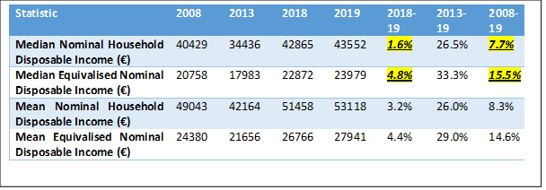
Median nominal disposable household income on the other hand grew by 26.5 percent between 2013 and 2019, 3.99% on average a year for six years. Once the CSO ‘equivalise’ this for household composition, the average rate is 4.91% and a 7 point difference over six years. The difference is most stark with the example of the 2018-2019 figures. Nominal income (which is a figure of actual income that exists in the real world) went up by 1.6% over the year, but the equivalised indicator showed three times the growth (4.8 percent)! Roughly translated that means that 2/3rds of the income growth between 2018 and 2019 was not income growth at all but the compositional effect of changing household arrangements. The difference in median equivalised household disposable income between 2008 and 2019 is twice the figure for actual household income (15.5 v 7.7 percent).
The fact that the population share of under 15s remained static between 2018 and 2019 and the population over 15 increased by 1.7 percent will push the average equivalised disposable income upwards (15+ are adults in these calculations). Since 2013, the difference in growth between the under 15’s and over 15’s was 6.6 points (1.5 compared to 8.1 percent). Children in a household will lower the equivalised disposable income estimate. Less mouths to feed = more (equivalised but not actual) income. I discussed the same compositional issue in relation to the growing share of adult children living at home and sharing renters previously.
The birth rate has been declining since 2009 and fell particularly sharply between 2013 and 2018. Now, most people under 40 in this country will understand from lived experience that that drop in under 15’s does not reflect some voluntary change to lifestyle. It’s a function of the inadequacy of wages and lack of decent work for younger generations in the post-2008 labour market. We’re having kids later, getting married later, and buying houses later. Indeed, while equivalised disposable household income went up on average in 2019, the mean and median figures fell for 18-24 year olds by 2.3 and 1 percent.
If younger generations are being forced to delay milestones en masse simultaneously, the compositional effect will push the equivalised indicator up. Clearly, those at the bottom of the income and wage distributions will feel these pressures disproportionately and will have to forego or delay having children at greater rates. This then suggests that income is growing at the bottom faster than it is. By extension and ironically, rising numbers of younger people unable to afford to start a family will positively affect the Irish GINI of equivalised disposable income.
There has been considerable attention given to this ‘falling inequality’ in 2019 recently.
The GINI coefficient is a blunt instrument that is not easily interpretable (by economists or anyone!). I pointed out here recently that the income figures from SILC exclude key sources of income for top earners and overstate the income of many low-wage workers and that a GINI coefficient based on these figures is incomplete and biased downward. Putting that aside for now, the implications of a reduction in the equivalised disposable income GINI coefficient from 0.3 to 0.29 could mean one of several things (Incidentally, Eurostat’s estimate of the Irish GINI coefficient (equivalised income) also fell, but not by as much as the CSO has it (28.9 to 28.3 compared to 29.7 to 28.8)). What does it say, for instance about the relationship between the bottom 10 percent and the top 10 percent? Nobody knows without further investigation. It’s generally reported in quite vague terms that ‘income inequality goes up, or goes down’. The data would more accurately be presented as ‘the estimate of this indecipherable and blunt indicator of income inequality is lower in 2019 than in 2018’. It could mean changes in either half of the income distribution. Maybe the median income grew relative to the top (which again, we underestimate, and probably underestimated more in 2019 than in 2018). It could be that the gap between the bottom and the median household narrowed. Nobody can say for certain without a further deep dive into the various household income indicators and their distribution and these details are not published in the SILC summary results. GINI coefficients as well as decile thresholds for gross household income, disposable household income, market income and wages would also improve our understanding but much of this data is lacking in an Irish context.
Total household market income increased by just 0.6 percent on average in 2019. Hardly a cause for celebration. Most of the increase in disposable income came from state transfers with considerable growth in income from old age payments and pensions (a group where the deprivation rate also increased in 2019, by the way). Average housing supports increased by 3.1 percent over the year and 11.1 percent since 2013. Other social transfers increased by 24.8 percent. Over the same period employment increased by 400,000. These payments should be falling in theory, as employment is supposed to help people escape dependency on the state (unemployment payments fell by 44 percent).
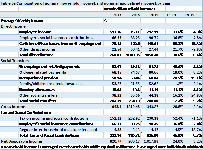
Between 2013 and 2019, employee income increased by 33.6 percent along with employment growth of 19.8 percent. Remember, that’s average employee income per household in Ireland (not per employee) so a good chunk of this is explained by increasing employment, rather than rising returns to labour. Employee income also grew by 4.3 percent in 2019 when the number of employees grew by 3.6 percent.
What actually happened to wages in this time? This is what really concerns most of the working age population. How much do I get in real euros for selling an hour, twenty, or 39 hours of my labour?
Although wage data is really patchy and unsatisfactory in an Irish context, especially going back before the financial crisis, we have some data.
According to the Earnings, Hours and Employment Cost Survey, between 2013 and 2019, a period of exceptional employment and GDP growth (26 percent in 2015) average hourly earnings increased by 7.9 percent (not much more than 1 percent a year) from €20.85 to €22.50. Average weekly earnings increased by 12.0 percent (less than 2 percent a year on average). This growth was uneven too, with high earners (Managers, Professionals, Associate Professionals and Technicians) seeing a 13.0 increase while there was less than a 10 percent increase for the bottom 56 percent or so of occupations (the difference in income gains between the ’salariat’ and the rest since 2010 is even higher).
When you actually get in to indicators of quality of life that are understandable to everyone the fact of the matter is that standards of living in Ireland were worse in 2019 than they were in 2007. They got worse between 2018 and 2019 when employment increased, production increased and average wages increased. The real story here is that living standards never recovered from 2008. There are almost twice the share of children living in households that cannot afford the basic necessities for a minimum essential standard of living in 2019 (more than 1 in 4) than in 2007 (13.6 percent). In-work enforced deprivation was higher in 2019 than in 2007 and for every age group. It was three times the rate for under 25’s (18.5 percent compared to 5.6 percent) and over twice the rate for 25-34 year olds group (12.9 percent compared to 5.9 percent).
When we’re comparing indicators around living standards over time or across countries, we have to ask ourselves, are we comparing the same thing? Is it like with like? If out of pocket childcare costs are upwards of 5 times the price in Ireland compared to Germany, where state subsidies are higher, income inequality indicators are not sufficient for comparing the distribution of living standards across the two countries. Ireland for instance, has the second lowest spending on General Government Individual consumption expenditure (Health, Education and Social expenditure) as a share of GDP (even with problems related to Irish GDP, it will still be relatively high) in the EU (not far behind Romania) and it’s much lower than it was before the financial crisis. Income has to go further in Ireland than it does in the high-income European countries to whom we compare ourselves.
Irish housing is a good example of a complexity that should be addressed in any discussion on living standards or the distribution of living standards over time that household income just doesn’t capture. As private market solutions to housing have come to dominate, supports such as the Housing Assistance Payment for low-income households to rent have been replacing the provision of social housing. This pushes what used to be located on the government balance sheet into household income. Specifically, household income for low-income households. Average housing support payments increased by 11.1 percent between 2013 and 2019. These supports push up income at the bottom (where there was no need for that income in the past) but are not really indicative of rising living standards at the bottom.
Actual Individual Consumption is Eurostat’s (not my) preferred indicator to compare living standards across countries, though it doesn’t capture distribution. This indicator is an attempt to factor in issues around welfare provision and consumption discussed earlier. On average, Irish living standards were 1% higher in 2019 than in 2007. In 2007, living standards were about 15 percent higher than the EU 28 average by this measure. In 2019, they are about 5 percent lower than the EU28 average and closer to Greece than Germany.
None of this is anything to celebrate. Some of the commentary in the last few weeks doing just that is the kind of stuff they use to justify raising the minimum wage by 10 cent an hour in the middle of a pandemic. Sure, if we’re so equal, why would they need 20 cent? It’ll also come in handy to provide academic legitimacy for austerity in the coming years.
Getting an accurate picture of the labour market and living standards in 2019 will be key in arguing against the urge to get us ‘back to normal’ after Covid, and to show that supporting decent work for increasingly pessimistic younger generations will require a significant rethink of economic policy.