

This weeks blog is by the NERI economist Ciarán Nugent. What this data suggests is that since 1980, the bottom half of the Irish adult income distribution lost 4 percentage points in the share of national income to the top 1 percent.
The evidence that income inequality has improved in Ireland over recent decades (or that it has remained relatively stable in a world where inequality has been growing) relies primarily on data gathered in a household survey called the Survey on Income and Living Conditions (SILC). The problems with voluntary household surveys in regard to accurately estimating income are well known (Dr Robert Sweeney of TASC sets out some of these here). These include non-response at the top and bottom of the income distribution, issues around self-reporting and relying on household members to accurately report the incomes of other household members. Additionally, SILC doesn’t include capital gains income which disproportionately goes to the top.
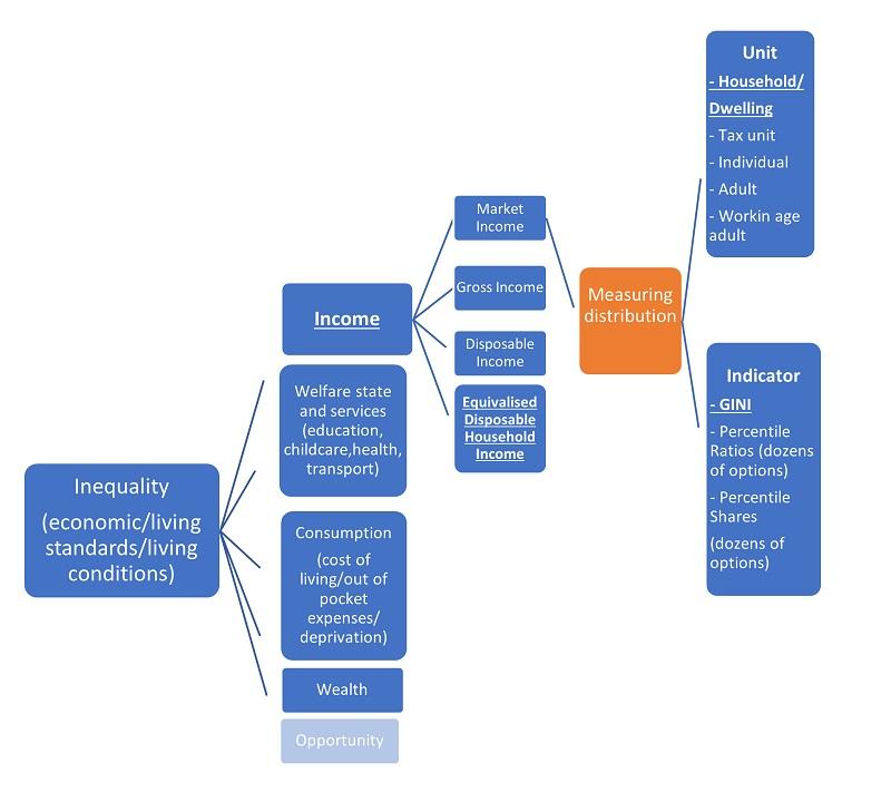
Income is just one indicator for living standards, which is really what we are talking about when we discuss inequality. Reflective of the fact that income is not a good indicator of living standards is the fact that there are at least four different income measures common in the literature (market income, gross income, disposable income and equivalised disposable income), each telling a different story. The data show that Ireland has the highest market household income inequality, but average equivalised disposable household income in an EU context (as measured by the GINI coefficient). The GINI for Gross Household Income (after government transfers but before taxes are deducted) in Ireland is the 5th highest in the EU. Gross and disposable income are given relatively little attention, at least more recently.
Both Cherishing all Equally (TASC) and the recent Hungry Bellies (UNITE) reports map out wider considerations in assessing social and economic inequality, which factor in the interaction of income, living expenses and opportunity (poverty, deprivation and the nature and breadth of the welfare state etc.).
Inequality is much wider than income alone.
With that said and leaving aside all that complexity, the evidence that income inequality has fallen in Ireland since the 1980’s is mixed at best.
The results really depend on which income indicator you think is most important (I’ve mentioned 4, but there are more), which unit you think is most appropriate (family income, household income, per adult income, tax unit income etc.) and which measurement indicator of distribution you decide on (the GINI coefficient, gap between the top 10 and bottom 10 percent, the share of the bottom 20 percent etc.).
The World Inequality Database (WID) provides data compiled on incomes across the world, including Ireland. (You can check where you sit relative to other Irish adults here: https://wid.world/simulator/IE/) Blanchet, Chancel and Gethin (2019) analyse the Irish income data in a wider paper on inequality in Europe. The Irish data, which is based on tax tabulations and survey microdata, gets a quality score of 4 out of 5 stars from the team in WID. For other countries in their dataset where no tax data is available, survey-based data are given 1 or 2 stars.
The WID provides data on the shares of income of different bands in the distribution (top 1 percent, top 10 percent etc.), more easily understandable to a wider audience (and to researchers for that matter!) than the GINI.
The unit of analysis is also different in WID. Rather than households (or what would more accurately be described as dwellings), this data is estimated at the level of individual adults, I’ve written before on the appropriateness of counting the income of the growing number of adult children living with their parents as household income and the income of sharing Generation Renters as households. The unit is not weighted by household composition either, the merit of which I find questionable, at least when results are presented without reference to other unweighted household incomes. For a good discussion on the implications of weighting disposable income by household type on measuring income distribution see this work by the UK’s ONS.
The data from WID is simply ‘the sum of all pre-tax personal income flows accruing to the owners of the production factors, labour and capital, before taking into account the operation of the tax/transfer system, but after taking into account the operation of pension system.’
The share of income going to the bottom 40 percent (this is one indicator the UN use for income inequality in the Sustainable Development Goals) was lower in 2019 than in 1980 (15 percent compared to 12.7 percent). Similarly, the share going to the bottom 50 percent of adults was 24 percent in 1980 compared to just below 20 percent in 2019. The share for both groups has improved slightly relative to the worst years of the recession.
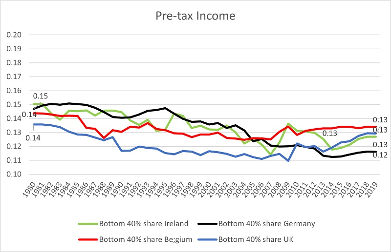

We see quite similar trends with a selection of European countries. The evidence suggests that the top 10 percent of adults in Germany have significantly increased their share of income over the past four decades with the UK and Ireland exhibiting very similar patterns.
Basically, what this data suggests is that since 1980, the bottom half of the Irish adult income distribution lost 4 percentage points in the share of national income to the top 1 percent. The share in 2016 had just about recovered to the pre-financial crisis peak of 13 percent after strong growth in earnings in the Professions and stagnation in lower earning professions (clerical, sales, services, manual etc.) between 2012 and 2016, driven in part by the continued freeze in the minimum wage. In addition, the WID note that some of the issues around recording top incomes in surveys also apply to tax data, due to tax evasion.


The data available on post-tax income is less exhaustive. It does show similar trends however, with the share of income of the bottom half of Irish adults slightly lower in 2019 than in 1980 and even lower than in 2012 after 7 years of strong employment growth. The after-tax share of the top 10 percent jumped between 2012 and 2016 from 24 to 28 percent even as unemployment fell. This was driven by austerity cuts to income supports at the very bottom of the distribution (younger jobseekers’ rates and eligibility, maintenance grants for students, rent supplement, fuel allowance, one parent payment etc.), increases in personal taxation such as the universal social charge, as well as widespread wage restraint both in the public and private sector, especially for new entrants. As the unit of measurement here is the individual adult, the impact of austerity is clearer in the data as much of these effects are obscured in data gathered at the household level. A 22-year-old on €100 a week jobseekers’ allowance would not show up in analysis at the household level as these adults could not afford to live in a household independently. Their €100 would be counted with their parent’s income to calculate household income. Though this concentration has not returned to the Celtic Tiger peak of 30 percent in 2006, it has come down slightly since 2016 (28 to 26 percent). The share of the bottom 50 percent in post-tax income has fallen by just over 1 pp since 2012.

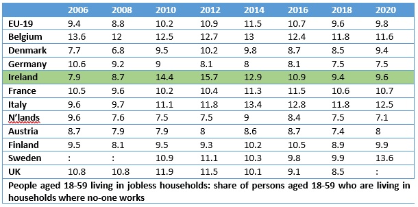
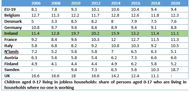
The GINI coefficient for market income inequality (before taxes and transfers) has Ireland the most unequal country in the EU and as one of the most unequal countries in the OECD. Worse than the US, the UK and even Russia. A much-cited explanation for this is a high number of jobless households in Ireland. This narrative has different policy implications than simply increasing the minimum wage to a living wage. However, the evidence is not suggestive of any uniquely Irish problem in this regard. This was certainly true at the height of the recession and tackling this problem was a theme in the Irish government’s dealings with the Troika. But Belgium has a higher share of working age adults in jobless households than Ireland (2019) but less market income inequality (the share of the bottom 40 and bottom 50 percent is higher). Germany on the other hand has less adults in jobless households but higher income inequality using the same metrics. The GINI coefficients of market income are lower for Belgium, France and Italy too (much lower for Italy), though they have higher shares of jobless households. Ireland does have higher rates of children in jobless households, however.
So, the idea that ‘we have gotten more equal over the past number of decades’ is probably not exactly accurate, even in the narrow terms of income. This story suggests an increasingly dynamic and healthy labour market, which doesn’t require any intervention as the market is naturally bringing about more equal outcomes. It would be more accurate to characterise developments as the state having to intervene more and more to maintain the after-tax distribution of household income in Irish society.
Ireland is known for its ‘transfer rich, service poor’ welfare regime relative to other high-income EU countries and this impacts positively on indicators of income distribution in an Irish context too. Some recent examples of this include increasing numbers on HAP payments and new childcare subsidies. This income, most of which is going to the bottom half of households/individuals makes the distribution of Irish income more equal than countries that provide more services, but it’s not really capturing developments in inequality of living standards.

Inequality in incomes is driven by inequality in wages, the most important component in incomes. Recent data from Eurostat suggests the distribution of Irish wages is among the widest in the entire EU. The gap between the worker at the 10th percentile and the worker at the 90th percentile is highest in Ireland of all high-income EU members, measured both by hourly rate (3.98) and by monthly earnings (3.71). Briefly translated, the earner at the 90th percentile earns 3.98 times the hourly rate of the earner at the 10th percentile. In hourly earnings the gap between the 90/10 ratios in Ireland and the next worst performer (the UK at 3.53) is huge. This gap is almost twice that of the best performer in the sample, Sweden where the difference is just over a factor of two (2.09).
The worker at the 10th percentile in Sweden earned €13.56 an hour, approximately 30 percent more than the Irish equivalent at €10.37 (remember €9.55 was the minimum wage in 2018). In terms of living standards, that Swedish worker also has a more developed welfare state with wider provision of services and less out of pocket expenses than the Irish one. On the other hand, the worker at the 90th percentile in Ireland earned 45 percent more per hour than the same worker in Sweden (€41.30 compared to €28.40).
Introducing a living wage is key to tackling Irish income inequality. It’s €12.30 an hour.