


How many of us know how our earnings compare? Do we know what percentage of other workers earn more or less than us? In looking at the infographic below, how does the average earnings for your sector or your job compare with what you earn?
Do we know how much a doctor, a solicitor or an accountant earns? Or a shop assistant or a delivery driver?
The fact is that the majority of us have no idea - or the wrong idea - of how our earnings compare with the rest of the population.
Finding people who are willing to discuss their incomes, or expenditure, or even attitudes to money, even anonymously, is a difficult task.
We often don't know how much our closest family members or friends earn.
Before you read on or look at the infographic, I want you to think about your own earnings - how do you think they compare with the earnings of other workers?
Are you relatively rich or poor? Have a think, what percentage of workers earn more or less than you? How do your perceptions match with the reality as presented in the infographic?
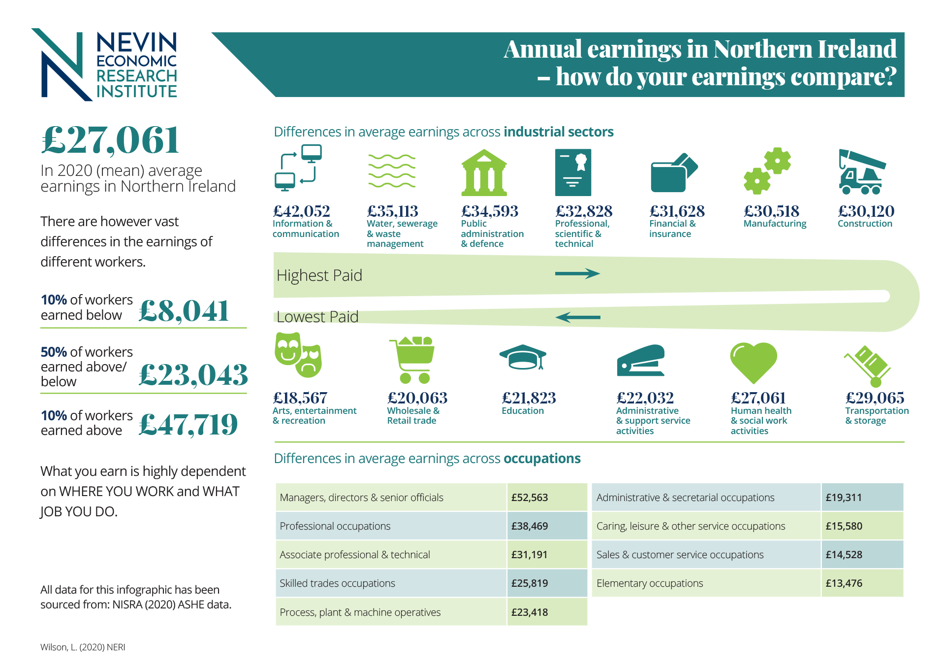
What if I told you that to earn more from your job than 50% of all other workers in Northern Ireland that you need to earn just over £23,000 per year?
Would this make you feel earnings rich or poor?
By the same token, what if I told you that 10% of all workers earn around £8,000 per year and 90% of all workers earn less than £47,700?
Previous research which has asked people to guess how their earnings compare found that, on average, people tend to guess that their earnings are closer to the middle of the earnings distribution, than is actually the case.
When the lowest paid make guesses about their relative position on the earnings distribution they tend to guess that they compare relatively better off than they actually do.
In contrast, when the highest paid make guesses, they guess that they compare relatively much worse than they actually do.
The high paid cannot fathom that the lowest paid are paid so little. The low paid cannot fathom that others are paid so much more.
These findings, however, have fundamental consequences for politics.
If the most well-paid in our society don't tend to realise that they are the most well-paid, whilst the lowest paid don't know they're the least well paid, how can we convince the highest paid that they can afford to pay a little more into the public purse and the lowest paid that they should demand higher rewards for their work?
Northern Ireland has the highest proportion of low-paid workers of all UK regions, with 25% of workers earning below the real living wage in 2020.
Earnings differ quite substantially and are highly dependent upon where one works and what job one does. For example, as shown in the infographic the ‘Information & Communication’ sector has the highest average earnings at just over £42,000. And unsurprisingly, given the impact of covid-19 those in the ‘Arts, Entertainment and Recreation’ sector have the lowest average annual earnings at around £18,500.
As shown in the infographic, in terms of job type the lowest paying occupations on average include those in ‘elementary occupations’ doing jobs such as cleaners, building caretakers, delivery drivers and porters. Now might you consider how might our health services and schools and wider society have managed through the pandemic without these workers?
How does the average earnings for your sector or your job compare with what you earn?